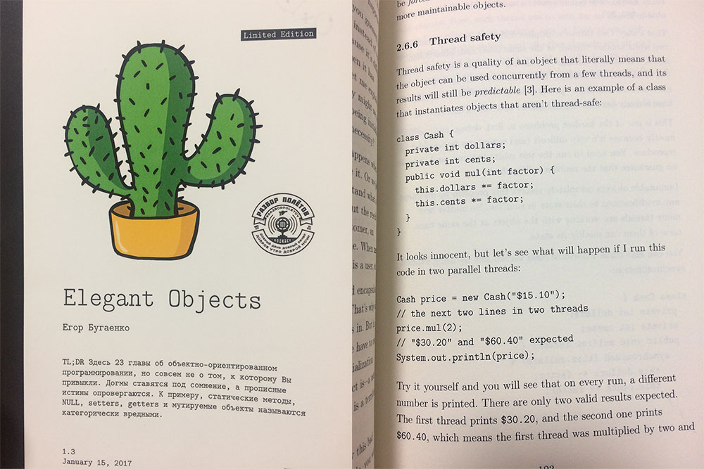
Elegant Objects

I’ve just got Yegor Bugayenko’s “Elegant Objects” book. Even without reading a single page of it, I can definitely say the book worths doing it. How do I know in advance you may ask?
That’s simple: it’s got great design. You may prove it too when opening the book at somewhere in the middle of it and scan the page.
How does an ordinary IT book look like? Usually, its design is full of details made without any sense. A typical O’Reilly book makes me feel like a kid: it has lots of different paragraph styles, borders, lines, gray bars. Before you start reading, there is a legend with up to five icons. Look, that icon means to be careful, this one stands for “experienced users only” and so forth. Every page carries the author’s name, the title of the book and the chapter caption as if I really need to keep all of that in my mind constantly.
Instead, the Yegor’s book are made of high quality design. Every page has only text but nothing else. No lines, bars or icons. There only two text stiles per the entire book, one is for ordinary text and the second one is for code. Again, the code is not put into the colored bar or whatever. It’s just text, and this is amazing.
Except the main text, there is no any information on a page but its number. I really appreciate such design because it servers the only thing it was aimed for – to encourage me to read the book (but not to buy and put it on my shelf).
Нашли ошибку? Выделите мышкой и нажмите Ctrl/⌘+Enter